
高度可定制且功能丰富的通知,显示在状态栏/刘海/灵动岛下方。 使用 Swift 编写,兼容 Obj-C!如果您认为有任何缺失或错误,请开启一个 Github issue。
- 可定制的颜色、字体和动画,并具有多个内置样式
- 交互式且可中断的拖动关闭
- 自适应、动态布局
- 内置药丸样式或全宽度布局
- 药丸宽度与显示的文本匹配(可定制)
- 适用于有刘海和无刘海设备
- 适用于横屏和竖屏
- 内置功能(自动布局)
- 标题、副标题和左侧视图(例如,图标)
- 一个活动指示器
- 一个进度条
- 自定义视图(UIView 或 SwiftUI View)
一些可能性的示例 - 药丸样式是默认样式
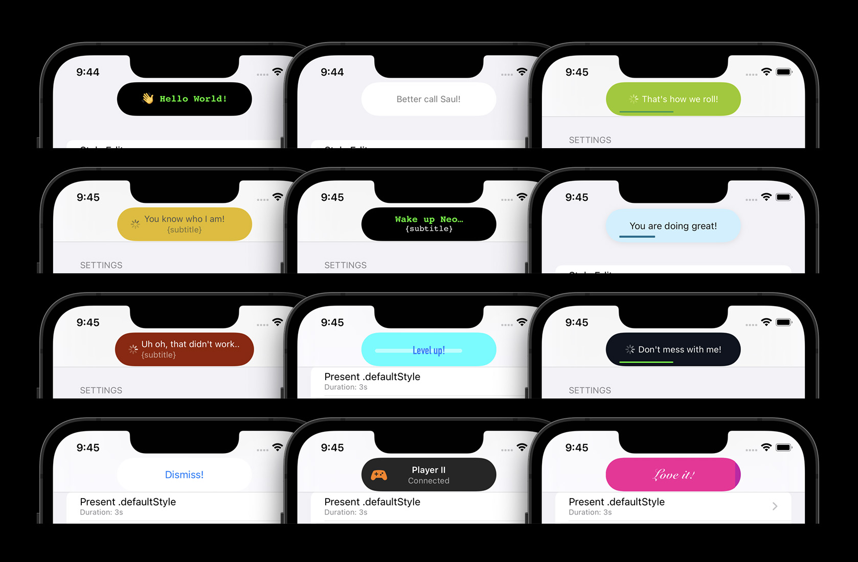
运行中的全宽度样式 - 上面的药丸样式支持相同的功能和动画
| 拖动以关闭 | 活动和进度条 | 自定义样式 |
|---|---|---|
 |
 |
 |
| 横屏应用(也支持设备旋转) |
|---|
 |
- SPM (Swift Package Manager)
- Xcode -> File -> Add packages:
git@github.com:calimarkus/JDStatusBarNotification.git - 导入
- 在 Swift 中:
import JDStatusBarNotification - 在 ObjC 中:
@import JDStatusBarNotification;
- 在 Swift 中:
- Xcode -> File -> Add packages:
- CocoaPods
pod 'JDStatusBarNotification'
- Carthage
github "calimarkus/JDStatusBarNotification"
- 手动
- 将
JDStatusBarNotification/JDStatusBarNotification文件夹复制到您的项目中。
- 将
查找托管在 Github 上的 类文档。
请参见 CHANGELOG.md
这里的所有示例都是用 Swift 编写的。 但是一切都可以从 Objective-C 中调用。 另请查看示例项目,其中包含许多示例,并包含一个方便的样式编辑器来构建自定义样式。
var body: some View {
    Button("Present/dismiss") {
      isPresented.toggle()
    }
    .notification(title: "Hello World", isPresented: $isPresented)
}
var body: some View {
    Button("Present/dismiss") {
      isPresented.toggle()
    }
    .notification(title: "A text",
                  subtitle: "with a little subtitle.",
                  isPresented: $isPresented,
                  isShowingActivity: $activity, // toggles an activity indicator on/off
                  progress: $progress,          // sets the percentage of a progress bar
                  includedStyle: .success)      // picks a predefined style
}
var body: some View {
    Button("Present/dismiss") {
      isPresented.toggle()
    }
    .notification(isPresented: $isPresented) {
      Text("👋 Hi there!")
        .font(.subheadline)
        .foregroundStyle(.white)
    }
}
NotificationPresenter.shared.present("Hello World")

// with completion
NotificationPresenter.shared.present("Hello World") { presenter in
    // ...
}
NotificationPresenter.shared.dismiss()

// with completion
NotificationPresenter.shared.dismiss(after: 0.5) { presenter in
   // ...
}
NotificationPresenter.shared.present("")
NotificationPresenter.shared.displayActivityIndicator(true)

let image = UIImageView(image: UIImage(systemName: "gamecontroller.fill"))
NotificationPresenter.shared.present("Player II", subtitle: "Connected")
NotificationPresenter.shared.displayLeftView(image)

NotificationPresenter.shared.present("Animating Progress…") { presenter in
  presenter.animateProgressBar(to: 1.0, duration: 0.75) { presenter in
    presenter.dismiss()
  }
}

// or set an explicit percentage manually (without animation)
NotificationPresenter.shared.displayProgressBar(at: 0.0)

有一些包含的样式,您可以使用以下 API 轻松使用
NotificationPresenter.shared.present("Yay, it works!",
                                     includedStyle: .success)

NotificationPresenter.shared.presentSwiftView {
    Text("Hi from Swift!")
}

// with completion
NotificationPresenter.shared.presentSwiftView {
    Text("Hi from Swift!")
} completion: { presenter in
   // ...
}
如果您想完全控制通知内容和样式,可以使用自己的自定义 UIView。
// present a custom view
let button = UIButton(type: .system, primaryAction: UIAction { _ in
  NotificationPresenter.shared.dismiss()
})
button.setTitle("Dismiss!", for: .normal)
NotificationPresenter.shared.presentCustomView(button)
| 浅色模式 | 深色模式 |
|---|---|
 |
 |
您可以选择轻松创建和使用完全自定义的样式。
在 NotificationStyleClosure 中修改样式
var body: some View {
    Button("Present/dismiss") {
      isPresented.toggle()
    }
    .notification(isPresented: $isPresented, style: {
      let s = $0.backgroundStyle
      s.backgroundColor = .black
      s.pillStyle.minimumWidth = 150
      s.pillStyle.height = 44
    }) {
      Text("👋 Hi there!")
        .font(.subheadline)
        .foregroundStyle(.white)
    }
}
PrepareStyleClosure 提供默认样式的副本,然后可以对其进行修改。 有关所有选项,请参见 StatusBarNotificationStyle API。
// update default style
NotificationPresenter.shared.updateDefaultStyle { style in
   style.backgroundStyle.backgroundColor = .red
   style.textStyle.textColor = .white
   style.textStyle.font = UIFont.preferredFont(forTextStyle: .title3)
   // and many more options
   return style
}

// set a named custom style
NotificationPresenter.shared.addStyle(named: "xxx") { style in
   // ...
   return style
}
或者查看示例项目,其中包含一个完整的样式编辑器。 您可以在应用程序中调整所有自定义选项,实时查看更改,甚至可以导出新创建样式的配置代码,以便在您的应用程序中轻松使用。

支持两种 StatusBarNotificationBackgroundType
enum {
    /// The background is a floating pill around the text.
    /// The pill size and appearance can be customized. This is the default.
    .pill,

    /// The background covers the full display width and the full status bar + navbar height.
    .fullWidth
}
支持的 StatusBarNotificationAnimationType
enum {
    /// Slide in from the top of the screen and slide
    /// back out to the top. This is the default.
    .move,

    /// Fade-in and fade-out in place. No movement animation.
    .fade,

    /// Fall down from the top and bounce a little bit, before
    /// coming to a rest. Slides back out to the top.
    .bounce
}
如果您的应用使用 UIWindowScene,则 NotificationPresenter 需要在您显示任何通知之前知道它。 该库尝试自动找到正确的 WindowScene,但这可能会失败。 如果失败,将不会显示任何通知。 您可以显式设置窗口场景以解决此问题
NotificationPresenter.shared().setWindowScene(windowScene)
我的 Twitter 是 @calimarkus。 如果您喜欢 JDStatusBarNotification,请随意 发推文。

最初基于 Kevin Gibbon 的 KGStatusBar