一个用于生成 AppKit 用户界面的 SwiftUI 风格的 DSL。

我有一些应用需要在 10.15 之前的版本上良好运行。即使在 10.15 上,SwiftUI 也可能会有一些错误。
有时候我必须用 AppKit 代码,而我总是觉得需要很多样板代码才能让相对简单的视图很好地显示出来 - 尤其是在使用自动布局的情况下!NSStackView 肯定让生活更轻松了,但它仍然会导致代码非常冗长且难以阅读。更重要的是 - 作为审查者,可能很难理解以编程方式生成的 AppKit 代码的意图。
所以我决定为 AppKit 视图创建一个 SwiftUI 风格的构建器 DSL。它确实加快了我在使用它的项目中的往返时间。如果您以 10.15 及更高版本为目标,甚至可以使用 SwiftUI 预览您的 DSFAppKitBuilder 视图。
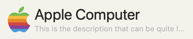
这是一个使用 DSFAppKitBuilder 大大简化的 AppKit 布局
------------------------------------
|         |  Name                  |
|  image  |------------------------|
|         |  Description           |
------------------------------------
- 图像是固定尺寸(42x42)
- 名称字体大小为 24,如果视图在水平方向上变得太小,则会截断
- 描述字体大小为 12,灰色,如果视图在水平方向上变得太小,则会截断
该库提供了一个自定义视图控制器 DSFAppKitBuilderViewController,您可以在构建自己的自定义视图时从中继承。
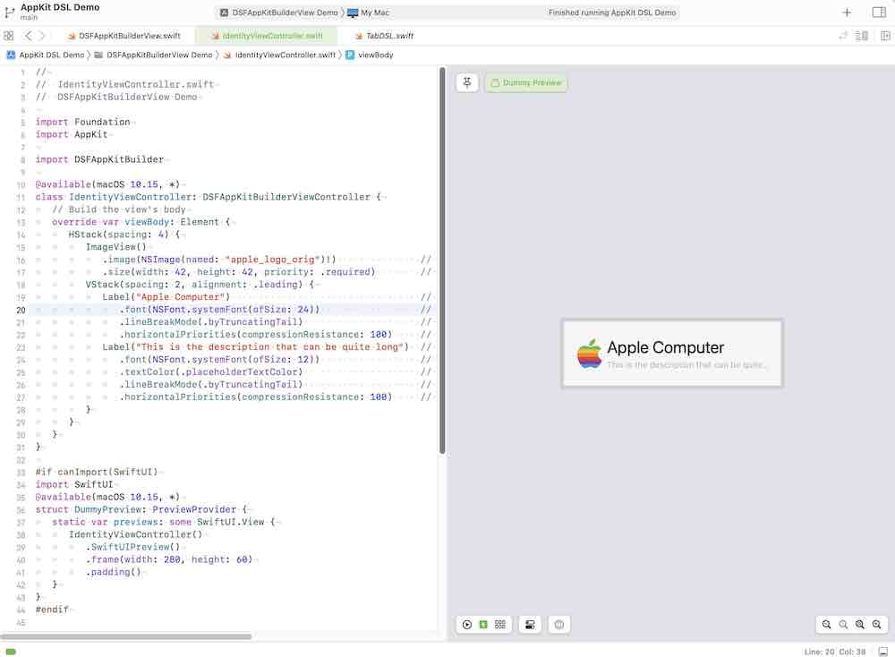
class IdentityViewController: DSFAppKitBuilderViewController {
   // Build the view's body
   override var viewBody: Element {
      HStack(spacing: 4) {
         ImageView()
            .image(NSImage(named: "apple_logo_orig")!)               // The image
            .size(width: 42, height: 42, priority: .required)        // fixed size
         VStack(spacing: 2, alignment: .leading) {
            Label("Apple Computer")                                  // The label with title 'Name'
               .font(NSFont.systemFont(ofSize: 24))                  // Font size 12
               .lineBreakMode(.byTruncatingTail)                     // Truncate line
               .horizontalPriorities(compressionResistance: 100)     // Allow the text field to compress
            Label("This is the description that can be quite long")  // The label with title 'Description'
               .font(NSFont.systemFont(ofSize: 12))                  // Font size 12
               .textColor(.placeholderTextColor)                     // Grey text
               .lineBreakMode(.byTruncatingTail)                     // Truncate line
               .horizontalPriorities(compressionResistance: 100)     // Allow the text field to compress
         }
      }
   }
}
结果是...
您可以在 Demos/Simple AppKitBuilder Test 文件夹中找到此演示。
这个库是关于构建 appkit 视图的。视图在构造视图对象时只构建一次,并且构建的视图层次结构的结构在此之后永远不会改变。
SwiftUI 的区别在于,每当它检测到更改时,它都会不断地重建视图层次结构,从而允许视图在其生命周期内彻底改变其层次结构。
您可以通过绑定到 isHidden(用于显示或隐藏子视图),以及绑定到 isEnabled 来启用和禁用控件,从而动态更改 DSFAppKitBuilder 视图中的视图。
如果您需要能够关闭/打开子视图,则绑定到 isHidden 属性以有条件地显示/隐藏
let showBinder = ValueBinder(false)
lazy var body: Element =
   VStack {
      Label("Apple")
      Label("label1: *some_condition* is true")
         .bindIsHidden(showBinder)
      Label("label2: *some_condition* is false")
         .bindIsHidden(showBinder.toggled())
   }
}
有许多方法可以构建和管理您的视图
DSFAppKitBuilderViewController 是一个自定义 NSViewController 派生类,它自动处理构建和显示您的视图。
只需在您的子类中重写 var viewBody: Element { ... },您就可以开始了!
DSFAppKitBuilderViewHandler 的级别稍低,允许您将视图组件包含在可组合对象中。
class AppKitLayoutDemoContainer: NSObject, DSFAppKitBuilderViewHandler {
   lazy var body: Element =
      HStack(spacing: 4) {
         ImageView()
            .image(NSImage(named: "apple_logo_orig")!)           // The image
            .size(width: 42, height: 42, priority: .required)    // fixed size
         VStack(spacing: 2, alignment: .leading) {
            Label("Apple Computer")                              // The label with title 'Name'
               .font(NSFont.systemFont(ofSize: 24))              // Font size 12
               .lineBreakMode(.byTruncatingTail)                 // Truncate line
               .horizontalPriorities(compressionResistance: 100) // Allow the text field to compress
            Label(identityDescription)                           // The description label
               .font(NSFont.systemFont(ofSize: 12))              // Font size 12
               .textColor(.placeholderTextColor)                 // Grey text
               .lineBreakMode(lineBreakMode)                     // Line break mode
               .horizontalPriorities(compressionResistance: 250) // Allow the text field to wrap
         }
         .edgeInsets(6)
      }
      .edgeInsets(8)
      .border(width: 0.75, color: .textColor)
      .backgroundColor(.quaternaryLabelColor)
      .cornerRadius(4)
}
要显示构建器内容,请将容器分配给 DSFAppKitBuilderView 的实例
class ViewController: NSViewController {
   @IBOutlet weak var mainView: DSFAppKitBuilderView!
   let identityContainer = AppKitLayoutDemoContainer()
   override func viewDidLoad() {
      super.viewDidLoad()
      mainView.builder = self.identityContainer  // Set our builder as the view's builder
   }
}
如果您发现您一遍又一遍地使用某个特定的元素分组,您可以创建自己的 Element 子类,该子类提供您的自定义布局作为其自身的 .
例如,在表单中,您可能会多次使用 label:textfield 模式。
-------------------------------------
|      Label | Text Field           |
-------------------------------------
|      Label | Text Field           |
-------------------------------------
|      Label | Text Field           |
-------------------------------------
创建一个 'LabelTextPair' Element 子类,该子类传入标签文本和一个字符串 ValueBinding…
/// An 'element' class which is a containerized eleement
class LabelTextFieldPair: Element {
   let label: String
   let textValueBinder: ValueBinder<String>
   init(label: String, value: ValueBinder<String>) {
      self.label = label
      self.textValueBinder = value
   }

   // Override the view() call of the `Element` base class to provide the element's body
   override func view() -> NSView { return self.body.view() }

   lazy var body: Element =
      HStack(distribution: .fillProportionally) {
         Label(self.label)
            .font(NSFont.boldSystemFont(ofSize: NSFont.systemFontSize))
            .alignment(.right)
            .width(150)
         TextField()
            .bindText(updateOnEndEditingOnly: true, self.textValueBinder)
            .horizontalPriorities(hugging: 10, compressionResistance: 10)
      }
}
然后在您的代码中像使用内置元素类型一样使用它!
let nameBinder = ValueBinder<String>("")
let usernameBinder = ValueBinder<String>("")
let nicknameBinder = ValueBinder<String>("")

VStack {
   LabelTextFieldPair(label: "Name", value: self.nameBinder)
   LabelTextFieldPair(label: "Username", value: self.usernameBinder)
   LabelTextFieldPair(label: "Nickname", value: self.nicknameBinder)
}
您可以在“Simple AppKitBuilder Test”演示中看到这一点。
修饰符允许您更改元素的默认行为。
注意: 与 SwiftUI 修饰符不同,这些修饰符返回原始修改对象,而不是副本。
Label("Name")
   .font(NSFont.systemFont(ofSize: 24))
   .lineBreakMode(.byTruncatingTail)
您可以为许多元素类型提供动作块。
Button(title: "Press Me!") { [weak self] _ in
  guard let `self` = self else { return }
  Swift.print("You pressed it!")
}
TextField(labelBinder)
  .onAppear {
    Swift.print("Label appeared in the window!")
  }
ValueBinder 是一个共享值容器,允许在对象之间共享一个值,并在该值发生更改时收到通知。这类似于 SwiftUI 中的 @Binding 对象。
您需要导入 DSFValueBinders 才能在您自己的代码中使用 ValueBinder(它将通过 DSFAppKitBuilder 提供给您)
import DSFAppKitBuilder
import DSFValueBinders
您可以在元素上使用绑定器来绑定到一个变量,从而在元素和控制器之间创建双向通信。
例如,以下代码将 userName 和 displayName 作为成员属性保存在容器类中。
- 如果代码更改了
userName(例如userName.wrappedValue = "fish"),UI 将自动更新为新值 - 如果用户更改了屏幕上
TextField中的值,ValueBinder 将自动反映这些更改
class MyExcitingViewContainer: NSObject, DSFAppKitBuilderViewHandler {

   // Bind the user name and the display name to fields
   let userName = ValueBinder<String>("")
   let displayName = ValueBinder<String>("")

   // The body of the view
   lazy var body: Element =
      VStack {
         TextField()
            .placeholderText("User Name")
            .bindText(self.userName)
         TextField()
            .placeholderText("Display Name")
            .bindText(self.displayName)
      }
}
某些元素(例如 Popover)需要来自视图层次结构的附加信息。例如,需要告诉 Popover 在显示时将其自身定位在哪里
这就是 ElementBinder 的用武之地。与 ValueBinder 类似,ElementBinder 允许您保留对元素的引用以供以后使用。
class MyController: NSObject, DSFAppKitBuilderViewHandler {
   let popoverLocator = ElementBinder()

   lazy var popover: Popover = Popover {
      Label("This is the content of the popup")
   }

   lazy var body: Element =
      Button("Show Popup") { [weak self] _ in
         guard
            let `self` = self,
            let element = self.popoverLocator.element
         else {
            return
         }
         self.popover.show(
            relativeTo: element.bounds,
            of: element,
            preferredEdge: .maxY
         )
      }
      .bindElement(self.popoverLocator)  // Store a reference to the button for later use
}
- 设置每个元素的拥抱优先级和压缩阻力
- 为元素设置固定的宽度和/或高度
TextField()
   .placeholderText("Noodles")
   .horizontalPriorities(hugging: 10)
| 元素类型 | 描述 |
|---|---|
Box |
一个 NSBox 包装器 |
Button |
一个 NSButton 包装器 |
FlatButton |
一个具有边框颜色、填充颜色的圆形 Button |
CheckBox |
一个配置为显示为复选框的 NSButton 包装器 |
ColorWell |
一个 NSColorWell 包装器 |
ComboBox |
一个 NSComboBox 包装器 |
ComboButton |
一个 NSComboButton 包装器,在 macOS 13 (Ventura) 之前的系统上回退到 DSFComboButton |
DatePicker |
一个 NSDatePicker 包装器 |
DisclosureView |
一个具有标题和可展开子元素的元素 |
HDivider |
一个水平分隔线元素 |
VDivider |
一个垂直分隔线元素 |
EmptyView |
一个间隔视图 |
Group |
一个包含另一个元素的元素 |
Image |
一个显示图像的简单视图 |
ImageView |
一个 NSImageView 包装器 |
Label |
一个配置为只读标签的 NSTextField 包装器 |
LevelIndicator |
一个 NSLevelIndicator 包装器 |
Link |
一个显示只读超链接的 NSTextField |
Pager |
一个分页控件 |
PathControl |
一个 NSPathControl 包装器 |
PopupButton |
一个 NSPopupButton 包装器 |
ProgressBar |
一个 NSProgressIndicator 包装器 |
RadioGroup |
一个分组的按钮堆栈,配置为单选组 |
ScrollView |
一个 NSScrollView 包装器 |
SearchField |
一个 NSSearchField 包装器 |
SecureTextField |
一个 NSSecureTextField 包装器 |
Segmented |
一个 NSSegmentedControl 包装器 |
Shape |
一个显示 CGPath 的视图 |
Slider |
一个 NSSlider 包装器 |
Stepper |
一个 NSStepper 包装器 |
Switch |
一个 NSSwitch 包装器 |
TextField |
一个配置为可编辑字段的 NSTextField 包装器 |
Toggle |
一个可缩放的切换按钮 (使用 DSFToggleButton) |
TokenField |
NSTokenField 的包装器 |
View |
任何 NSView 实例的包装器 |
VisualEffectView |
一个包含子元素的 NSVisualEffectView 实例的包装器 |
Window |
一个 NSWindow 包装器 |
| 元素类型 | 描述 |
|---|---|
DisclosureGroup |
一个 DisclosureView 元素集合的元素 |
DynamicElement |
一个热插拔元素,它显示包含在 ValueBinder 中的视图 |
Flow |
一个元素,它是跨越然后向下流动的元素的集合 |
Form |
一个模拟表单的元素 |
Grid |
一个 NSGridView 包装器 |
List |
一个“列表”样式的元素,它从元素数组构建其内容,并在元素数组更改时动态更新其内容 |
HStack |
一个水平堆栈 |
VStack |
一个垂直堆栈 |
ZStack |
将多个元素分层堆叠在一起 |
TabView |
一个 NSTabView 包装器 |
SplitView |
一个 NSSplitView 包装器 |
| 元素类型 | 描述 |
|---|---|
Maybe |
一个元素,如果满足条件,则将一个元素插入到视图中 |
OneOf |
一个元素,它将多个元素的可见性绑定到 ValueBinder<> 值 |
DynamicElement |
一个元素,它将显示的 Element 绑定到 ValueBinder<> |
let _alertVisible = ValueBinder(false)
func alertBuilder() -> NSAlert {
   let a = NSAlert()
   a.messageText = "Delete the document?"
   a.informativeText = "Are you sure you would like to delete the document?"
   a.addButton(withTitle: "Cancel")
   a.addButton(withTitle: "Delete")
   a.alertStyle = .warning
   return a
}
…
   Button(title: "Display an alert") { [weak self] _ in
      self?._alertVisible.wrappedValue = true
   }
   .alert(
      isVisible: self._alertVisible,
      alertBuilder: self.alertBuilder
   )
let _popoverVisible = ValueBinder(false)
…
   Button(title: "Display a popover") { [weak self] _ in
      self?._popoverVisible.wrappedValue = true
   }
   .popover(
      isVisible: self._popoverVisible,
      preferredEdge: .maxY,
      {
         // Content for the sheet goes here
         Label("Content here")
      }
   )
let _sheetVisible = ValueBinder(false)
…
   Button(title: "Show sheet") { [weak self] _ in
      self?._sheetVisible.wrappedValue = true
   }
   .sheet(
      isVisible: self._sheetVisible,
      {
         // Content for the sheet goes here
         Label("Content here")
      }
   )
如果您的应用以 10.15 及更高版本为目标,您可以使用 SwiftUI 预览来预览您的 DSFAppKitBuilder 作品。
以下类型提供 .SwiftUIPreview() 方法调用,该方法返回 DSFAppKitBuilder 视图的 SwiftUI 包装表示。
ElementDSFAppKitBuilderViewControllerDSFAppKitBuilderViewHandler
显示使用 SwiftUI 生成预览的示例
@available(macOS 10.15, *)
class IdentityViewController: DSFAppKitBuilderViewController {
   // Build the view's body
   override var viewBody: Element {
      HStack(spacing: 4) {
         ImageView()
            .image(NSImage(named: "apple_logo_orig")!)               // The image
            .size(width: 42, height: 42, priority: .required)        // fixed size
         VStack(spacing: 2, alignment: .leading) {
            Label("Apple Computer")                                  // The label with title 'Name'
               .font(NSFont.systemFont(ofSize: 24))                  // Font size 12
               .lineBreakMode(.byTruncatingTail)                     // Truncate line
               .horizontalPriorities(compressionResistance: 100)     // Allow the text field to compress
            Label("This is the description that can be quite long")  // The label with title 'Description'
               .font(NSFont.systemFont(ofSize: 12))                  // Font size 12
               .textColor(.placeholderTextColor)                     // Grey text
               .lineBreakMode(.byTruncatingTail)                     // Truncate line
               .horizontalPriorities(compressionResistance: 100)     // Allow the text field to compress
         }
      }
   }
}

#if canImport(SwiftUI)
import SwiftUI
@available(macOS 10.15, *)
struct IdentityViewPreview: PreviewProvider {
   static var previews: some SwiftUI.View {
      IdentityViewController()
         .SwiftUIPreview()
         .frame(width: 280, height: 60)
         .padding()
   }
}
#endif
无论何时为 ValueBinder 或 Element 提供块时,如果该块捕获 self,则必须确保您捕获 self 为 weak 或 unowned。
let resetEnabled = ValueBinder<Bool>(false)

/// The following binder captures self, which will mean that the element that it is bound to will leak
lazy var badTextBinder = ValueBinder("The initial value") { newValue in
	self.resetEnabled.wrappedValue = !newValue.isEmpty
}

/// The following binder captures self weakly, which means that self is no longer in a retain cycle
lazy var goodTextBinder = ValueBinder("The initial value") { [weak self] newValue in
	self?.resetEnabled.wrappedValue = !newValue.isEmpty
}

...

TextField()
  .bindText(self.badTextBinder)    // <- Text field will leak as self is captured in a retain cycle
如果您认为您有泄漏,您可以设置 DSFAppKitBuilderShowDebuggingOutput = true 以在调试器输出窗格中报告元素销毁调用。
将 https://github.com/dagronf/DSFAppKitBuilder 添加到您的项目中。
该代码已记录在案,并且在通过 jazzy 或类似的文档生成器工具运行时,将为每个元素生成漂亮的文档。
> swift doc generate --module-name DSFAppKitBuilder --output docs .
> jazzy
SplitView需要是一个顶层对象。它们真的不喜欢在自动布局容器中使用(例如,将 splitview 嵌入到 stackview 中)
MIT License

Copyright (c) 2024 Darren Ford

Permission is hereby granted, free of charge, to any person obtaining a copy
of this software and associated documentation files (the "Software"), to deal
in the Software without restriction, including without limitation the rights
to use, copy, modify, merge, publish, distribute, sublicense, and/or sell
copies of the Software, and to permit persons to whom the Software is
furnished to do so, subject to the following conditions:

The above copyright notice and this permission notice shall be included in all
copies or substantial portions of the Software.

THE SOFTWARE IS PROVIDED "AS IS", WITHOUT WARRANTY OF ANY KIND, EXPRESS OR
IMPLIED, INCLUDING BUT NOT LIMITED TO THE WARRANTIES OF MERCHANTABILITY,
FITNESS FOR A PARTICULAR PURPOSE AND NONINFRINGEMENT. IN NO EVENT SHALL THE
AUTHORS OR COPYRIGHT HOLDERS BE LIABLE FOR ANY CLAIM, DAMAGES OR OTHER
LIABILITY, WHETHER IN AN ACTION OF CONTRACT, TORT OR OTHERWISE, ARISING FROM,
OUT OF OR IN CONNECTION WITH THE SOFTWARE OR THE USE OR OTHER DEALINGS IN THE
SOFTWARE.