


| 漂浮窗 | Toast 提示 | 弹出框 | 底部抽屉 |
|---|---|---|---|
 |
 |
 |
 |


您可以在任何内容的顶部显示多个弹出框,并且它们还可以让点击事件传递到较低的视图。 有 3 种显示弹出框的方式:作为简单的覆盖层,使用 SwiftUI 的 fullscreenSheet,以及使用 UIKit 的 UIWindow。 这些方法各有优缺点,下面是一个表格。
| 覆盖层 | 底部抽屉 | 窗口 | |
|---|---|---|---|
| 显示在导航栏顶部 | ❌ | ✅ | ✅ |
| 显示在底部抽屉顶部 | ❌ | ❌ | ✅ |
| 显示多个弹出框 | ✅ | ❌ | ✅ |
| 点击可以“穿透”透明背景 | ✅ | ❌ | ✅ |
| SwiftUI @State 更新机制按预期工作 | ✅ | ✅ | ❌ |
基本上,基于 UIWindow 的弹出框是大多数情况下最好的选择,只需记住 - 为了获得足够的 UI 更新,请使用 ObservableObjects 或 @Bindings 而不是 @State。 这种方法不起作用
struct ContentView1 : View {
    @State var showPopup = false
    @State var a = false

    var body: some View {
        Button("Button") {
            showPopup.toggle()
        }
        .popup(isPresented: $showPopup) {
            VStack {
                Button("Switch a") {
                    a.toggle()
                }
                a ? Text("on").foregroundStyle(.green) : Text("off").foregroundStyle(.red)
            }
        } customize: {
            $0
                .type(.floater())
                .closeOnTap(false)
                .position(.top)
        }
    }
}
这种方法有效
struct ContentView1 : View {
    @State var showPopup = false
    @State var a = false

    var body: some View {
        Button("Button") {
            showPopup.toggle()
        }
        .popup(isPresented: $showPopup) {
            PopupContent(a: $a)
        } customize: {
            $0
                .type(.floater())
                .closeOnTap(false)
                .position(.top)
        }
    }
}

struct PopupContent: View {
    @Binding var a: Bool

    var body: some View {
        VStack {
            Button("Switch a") {
                a.toggle()
            }
            a ? Text("on").foregroundStyle(.green) : Text("off").foregroundStyle(.red)
        }
    }
}
引入了新的 DisplayMode 枚举来代替 isOpaque。 isOpaque 现在已弃用。 使用以下代码代替:
.popup(isPresented: $toasts.showingTopSecond) {
    ToastTopSecond()
} customize: {
    $0
        .type(.toast)
        .isOpaque(true) // <-- here
}
使用:
.popup(isPresented: $floats.showingTopFirst) {
    FloatTopFirst()
} customize: {
    $0
        .type(.floater())
        .displayMode(.sheet) // <-- here
}
因此,新的 .displayMode(.sheet) 对应于旧的 .isOpaque(true),.displayMode(.overlay) 对应于 .isOpaque(false)。 默认的 DisplayMode 是 .window。
- 放大/缩小 出现/消失动画
disappearTo参数用于指定消失动画方向 - 可以与appearFrom不同
要包含新的 .zoom 类型,已重命名 AppearFrom 枚举案例。 使用以下代码代替:
.popup(isPresented: $floats.showingTopFirst) {
    FloatTopFirst()
} customize: {
    $0
        .type(.floater())
        .appearFrom(.top) // <-- here
}
使用:
.popup(isPresented: $floats.showingTopFirst) {
    FloatTopFirst()
} customize: {
    $0
        .type(.floater())
        .appearFrom(.topSlide) // <-- here
}
使用以下代码代替:
.popup(isPresented: $floats.showingTopFirst, type: .floater(), position: .top, animation: .spring(), closeOnTapOutside: true, backgroundColor: .black.opacity(0.5)) {
    FloatTopFirst()
}
使用:
.popup(isPresented: $floats.showingTopFirst) {
    FloatTopFirst()
} customize: {
    $0
        .type(.floater())
        .position(.top)
        .animation(.spring())
        .closeOnTapOutside(true)
        .backgroundColor(.black.opacity(0.5))
}
使用此 API,您可以按任意顺序传递参数。
要将弹出框显示在包括导航栏在内的所有其他视图之上,请使用
.popup(isPresented: $floats.showingTopFirst) {
    FloatTopFirst()
} customize: {
    $0.isOpaque(true)
}
这也意味着您将无法“点击穿透”弹出框的背景来点击其“背后”的任何控件(这是因为此方法实际上使用透明的 fullscreenSheet,它不会将触摸事件传递给底层视图)。 不透明的弹出框使用屏幕尺寸来计算其位置。
不幸的是,如果 opaque 为 false(允许“穿透触摸”),即使强制设置为全屏,弹出框也会显示在导航栏下方(如果您知道如何克服此限制,请在评论中告诉我)。 请记住,在这种情况下,弹出框使用您将其附加到的视图的框架来计算其位置,以避免位于导航栏下方。 因此,您可能希望将其附加到应用程序的根视图。
- 添加一个 bool 值来控制弹出框的显示状态
- 将
.popup修饰符添加到您的视图。
import PopupView

struct ContentView: View {

    @State var showingPopup = false

    var body: some View {
        YourView()
            .popup(isPresented: $showingPopup) {
                Text("The popup")
                    .frame(width: 200, height: 60)
                    .background(Color(red: 0.85, green: 0.8, blue: 0.95))
                    .cornerRadius(30.0)
            } customize: {
                $0.autohideIn(2)
            }
    }
}
isPresented - 用于确定是否应在屏幕上看到或隐藏弹出框的绑定
view - 您希望在弹出框上显示的视图
item - 绑定到 item:如果 item 的值为 nil - 弹出框隐藏,如果非 nil - 显示。 小心 - 库在关闭动画期间会复制您的 item!!
view - 您希望在弹出框上显示的视图
在 popup 修饰符中使用 customize 闭包
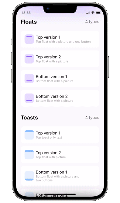
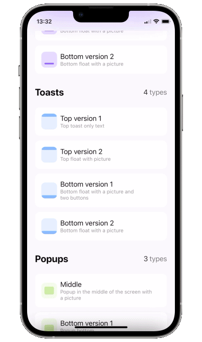
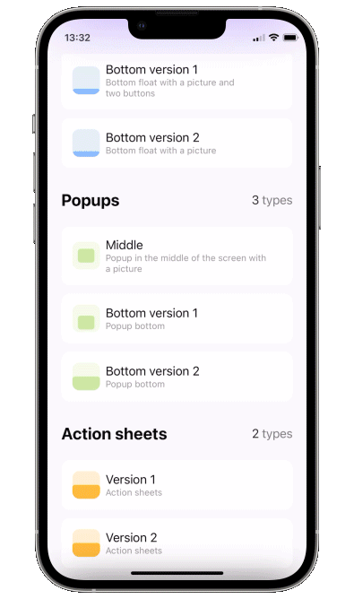
类型:
default- 屏幕中心的常规弹出框- toast - 适合屏幕,即没有内边距且忽略安全区域
- floater - 具有内边距并且可以选择使用或忽略安全区域
- scroll - 为您的内容添加滚动,如果您滚动到此滚动的顶部,则手势将继续进行弹出框的拖动关闭。
floater 参数
verticalPadding- 内边距,用于定义相对于垂直边缘的内边距,如果useSafeAreaInset为 true,则会添加到安全区域horizontalPadding- 内边距,用于定义相对于水平边缘的内边距,如果useSafeAreaInset为 true,则会添加到安全区域useSafeAreaInset- 是否将安全区域插图包含在 floater 内边距中
scroll 参数
headerView - 顶部的视图,不会成为滚动的一部分(如果需要)
position - topLeading, top, topTrailing, leading, center, trailing, bottomLeading, bottom, bottomTrailing appearFrom - topSlide, bottomSlide, leftSlide, rightSlide, centerScale: 确定出现动画的方向。 如果留空,它会复制 position 参数:因此,如果 position 设置为 .top,则从 .top 边缘出现 disappearTo - 与 appearFrom 相同,但用于消失动画。 如果留空,它会复制 appearFrom。 animation - 用于将弹出框滑动到屏幕上的自定义动画
autohideIn - 弹出框应消失的时间
dragToDismiss - 默认为 true:启用/禁用拖动以关闭(对于 .top 弹出框类型向上拖动,对于 .bottom 和默认类型向下拖动)
closeOnTap - 默认为 true:启用/禁用点击弹出框时关闭
closeOnTapOutside - 默认为 false:启用/禁用点击弹出框外部时关闭
backgroundColor - 默认为 Color.clear:更改外部区域的背景颜色
backgroundView - 外部区域的自定义背景构建器(如果设置了此项,则忽略 backgroundColor)
isOpaque - 默认为 false:如果为 true,则点击事件不会穿透弹出框的背景,并且弹出框显示在导航栏顶部。 有关更多信息,请参见“显示在导航栏上方”部分
useKeyboardSafeArea - 默认为 false:如果为 true,则在显示键盘时,弹出框会向上移动 keyboardHeight dismissCallback - 关闭弹出框后要调用的自定义回调
要实现底部抽屉(如第 4 个 gif 中所示),请在底部 toast 上启用 dragToDismiss(有关卡片本身的实现,请参见示例项目)
.popup(isPresented: $show) {
    // your content
} customize: {
    $0
        .type (.toast)
        .position(.bottom)
        .dragToDismiss(true)
}
要尝试 PopupView 示例
- 克隆存储库
https://github.com/exyte/PopupView.git - 打开终端并运行
cd <PopupViewRepo>/Example/ - 运行
pod install以安装所有依赖项 - 运行 open
PopupViewExample.xcworkspace/以在 Xcode 中打开项目 - 试试看!
dependencies: [
    .package(url: "https://github.com/exyte/PopupView.git")
]
要安装 PopupView,只需将以下行添加到您的 Podfile 中
pod 'ExytePopupView'
要使用 Carthage 将 PopupView 集成到您的 Xcode 项目中,请在您的 Cartfile 中指定它
github "Exyte/PopupView"
- iOS 15.0+ / macOS 11.0+ / tvOS 14.0+ / watchOS 7.0+
- Xcode 12+
Grid - 最强大的 Grid 容器
ScalingHeaderScrollView - 具有粘性标题的滚动视图,标题会在滚动时缩小
AnimatedTabBar - 具有许多预设动画的选项卡栏
MediaPicker - 可自定义的媒体选择器
Chat - 聊天 UI 框架,具有完全可自定义的消息单元格、输入视图和内置的媒体选择器
OpenAI OpenAI REST API 的包装器库
AnimatedGradient - 动画线性渐变
ConcentricOnboarding - 动画入职流程
FloatingButton - 浮动按钮菜单
ActivityIndicatorView - 许多动画加载指示器
ProgressIndicatorView - 许多动画进度指示器
FlagAndCountryCode - 每个国家/地区的电话代码和标志
SVGView - SVG 解析器
LiquidSwipe - 流体导航动画